A Tale of Two Forms.
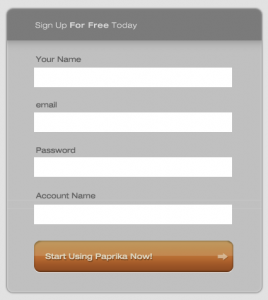
Yesterday we launched Paprika. Overall the launch was a success, but we did need to make some adjustments midstream. Mainly to our signup form. Here’s what we launched with:
Clean, simple, easy. As it turns out- not really. We did two things to shorten the form, and make it more aesthetically pleasing.
- We got rid of the password confirmation field. No harm done; if you fat-finger it when you enter it, you can just reset it later.
- We called the last form field “Account Name” and did not explain what this means. To our thinking, it was common terminology and used widely when referring to web apps.
We did a third thing that also hampered the usability of the form… We didn’t make the passwords the last thing on the list.
We had all sorts of people putting the password into the account name field thinking it was the confirmation. More still entered special characters and spaces into the account name only to be greeted by a form error, and forced to go back again.
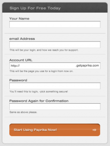
We quickly worked on a redesigned form:
Much better! Not a single support request or lost user today.
- We added explanations beneath the unobvious form fields.
- Added a cool, absolutely positioned, text example of how the account url will be used in practice.
- Added the password confirmation back in.
- Made a brighter button, and upped the contrast on the text.
It goes back to something we’ve said before- users aren’t stupid, they just want simple things. In our effort to cut the form down to only the essential elements, we went too far. Bumper rails make bowling easier, and we want everything to be easy!
Check the form out online here.


