Content is King (and yes, the crown does blend)
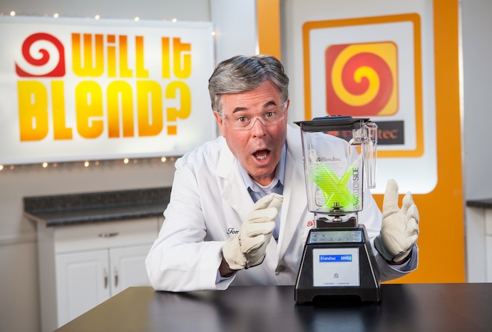
The Blendtec videos were viewed over six million times within five days of their posting on YouTube and on Blendtec’s website. They’ve been viewed more than 100 million times since.
Keep Reading
The Blendtec videos were viewed over six million times within five days of their posting on YouTube and on Blendtec’s website. They’ve been viewed more than 100 million times since.
Keep Reading“The biggest mistake I observe when it comes to information architecture is in the naming of pages and sections. The problem manifests itself in three ways:
Cool guy.
“Chris Rock says: ‘A lot of comedians have great jokes, and they’re like, ‘Why is this not working?’ It’s not working because the audience doesn’t understand the premise. If I set this premise up right, this joke will always work.’ The comics talk about ensuring the audience — so demanding, so easily distracted — is with them for every joke during the act. This doesn’t mean talking down or pandering. Rather, it’s good old-fashioned respect. I sometimes tell students that every design needs a welcome mat and a doorknob. The first helps a person realize, ‘Hey, this is for me.’ The second gives them a way into the design. Good design, like good comedy, is about surprise. But surprise can’t happen in a vacuum. It needs a context that establishes familiarity. If you respect your audience, you provide that context.’
http://observersroom.designobserver.com/oblog/post/seven-things-designers-can-learn-from-stand-up-comics/27038/
You can almost hear Dieter Rams reading this article in his thick accent.
“Good content is user-centered…
Publishing content that is self-absorbed in substance or style alienates readers. Most successful organizations have realized this, yet many sites are still built around internal org charts, clogged with mission statements designed for internal use, and beset by jargon and proprietary names for common ideas.
If you’re the only one offering a desirable product or service, you might not see the effects of narcissistic content right away, but someone will eventually come along and eat your lunch by offering the exact same thing in a user-centered way.”
http://www.alistapart.com/articles/a-checklist-for-content-work/
“The percentage of our time we spend on DVD by mail [still Netflix’s biggest revenue source by far] is tiny. We’re entirely focused on streaming.” Most newspaper companies’ organization and usage of staff time is focused on print. That means it is facing today, if not yesterday. Expend as few resources on the current operating model as possible, says Hastings, and run to the future. Put your best minds there — and most of your company. ‘We knew that the DVD business was temporary when we founded the company. That’s why we named it Netflix and not DVD by mail. We wanted to become Netflix.’ Whatever the brand name, aspire to what and who you want to become.”
“I’m kind of weird, I love negative feedback. Unsolicited complaint means somebody cared enough to write it down, and then when you fix their pet peeve they transform into a fan. Plus you got to fix a real problem for a real person, which is pretty rewarding.”
http://ignorethecode.net/blog/2010/09/21/chris_clark/ via DF
Notice how content has become the byword for stuff on a website? There’s a simple explanation; it’s the same shit sliced differently.
For years digital media types have been creating new words to resell old ideas to existing clients:”Moving forward = vague description of actually doing work.
Low hanging fruit = the least amount of work completed for the same money.
Social Media Evangelists = out of work journalists.So ‘content’ is just expensive copy?
No. Content describes all the elements that make a website worth looking at. It’s design that doesn’t make your eyes bleed, copy that gives direction and usability that’s, well, useable. Content is a word that describes all these elements working together to form a cohesive message. We’ve just started using it more openly because we think you’re ready for it, dear.
This has nothing to do with app development, – but I’m so excited about this show, I have to post the preview.