A Lucid Revelation.
A lot of conversation about modal editing recently brought our studio to a very simple conclusion- one that seemed undeniable the second we arrived at it.
The consequence of any action must be near the action itself to prevent confusion.
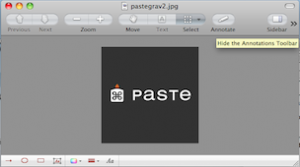
For example, when I’m in “Preview”, and I want to make a simple edit to an image, I click “Annotate”, but I don’t immediately see the result. That’s because it happened away from where I clicked, which is not what I expected. I have to search for it, which is frustrating.
Instead of popping up somewhere near the annotate button, a tool bar drops down from the bottom of the preview screen, which depending on how big your Preview window is, isn’t always readily visible.
This threw me off just enough to make me realize that other people probably have the same frustration/hesitation. It’s something many people take for granted and expect out of the apps they use- usability based on expectations.
It seems too simple to have to put into words, but I’m going to do it anyway. For every action, there should be a nearby reaction.

