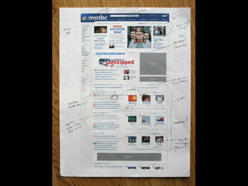
Printing Pixels
 I’ve always laughed at clients who insist on printing out websites for review. It’s like looking at a picture of a painting… The medium itself is what makes the thing what it is. Once you remove the media, the identity of the thing you’re reviewing is essentially lost.
But when I saw this slide in the excellent slide deck called Good vs. Great Design by Cameron Moll I sort of wanted to print a website. Now I have no idea what Cameron is saying during this slide in the real presentation. Maybe he’s making fun of people who print websites too. But what I see is a tactile way to review content and hierarchy.
There are lots of markup tools for online mockup reviews. But they all feel like using a butter knife to cut steak. You want to directly interact and scribble with your hands, not draw boxes and type text in Markerfelt. Why not print out a website big, stand 10 feet away and blur your eyes? We’ve been doing that stuff for print work for years. Maybe a change in perspective will help you focus more clearly on making the site read at a glance. Plus being able to doodle, sketch, and cross things out is always a liberating experience.
