Page Description Diagrams – a Primer.
Page Description Diagrams (PDD’s from now on) are not a new concept. But they’re pretty new to me. From what I’ve been able to source, the idea goes back to Dan Brown (Not the Davinci Code one).
My summary of the idea goes like this: when information architects, clients, account executives, and copy writers plan websites, they struggle to clearly denote the hierarchy that the marketing and architecture dictates without stepping on the designer’s toes. So they spend lots of time making interface wireframes that are either disposed of, or end up limiting the creativity of the design staff.
Agreed
I agree 1000%. Interface wireframes are great tools for diagramming, but too often they are used in ways that hamper good web development process. Non-visual thinkers use these tools to try and communicate visually, and end up making websites that look like lots of tiny little boxes with different backgrounds. Since color, typography, and interaction are all foreign concepts, and aren’t easily portrayed within the tools available, non-designers just make things bigger to convey hierarchy. Things look weird, and work weirder.
PDD’s are a simple way to solve this problem using a tool everyone knows how to operate. Basically a PDD is a simple text list of items that go on a page ordered by rank of importance. You textually describe the element, or feature and then rank it. This is great because:
- It forces you to choose #1, #2, #3 etc. No more trying to make everything important.
- It’s simple, and even non-visual thinkers can do it.
- You don’t waste a lot of time with sketches that will just get thrown away.
- This process lets the IA and marketing people control what they need to control while letting designers do their job.
To make a PDD you can choose any text editor, spreadsheet, or page layout program. You can even use the oh-so-beloved by office workers, Powerpoint if you choose.
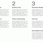
You’re shooting for something that looks roughly like this:

The columns indicate a general hierarchy level, 1 being of most importance and descending from there. You can stack as many items in a column as you like, but not everything can be a “1.” You can establish your own rules, but I would try for less than three “1s” five “2s” and five “3s.” If you are working on a really large or complex site, it’s possible that you will have more elements, or columns in your plan.
Workflow
The PDD flow is really flexible and should allow for pretty much any site to be organized. Within each of the items you prioritize, you can quickly describe them, link to an attachment, or if absolutely needed, make a little sketch. Simple.
We use Jumpchart quite effectively for this type of planning. We textually list our our content in order of importance, and link between pages using the normal process. Once everything is organized according to hierarchy, its really easy to remove the extra bits, and turn a planning document into a living content wireframe that can be exported. It’s a natural flow to move straight from organizing this way to generating actual copy.
Wrapping Up
Not every website planning process will need PDDs. They’re an abstracted layer, but a necessary one in many cases. Small teams building small projects will likely be able to skip this step for a more fleet-of-foot process. But as more layers are added, more people are involved, and more departments need pleased, a process like this helps keep a project on track. Forcing your team to commit to making certain elements more dominant than others helps keep you focused on what’s most important.
We always encourage developers to keep their websites goal-based. Clear hierarchy helps create clear call-to-action. Clear call-to-action helps create cleaner designs, simpler processes for users, and in most cases… better sales results.
