How We Doubled Our Conversion Rate on Jumpchart
Even before Paste, we’d been designing sites for a long time. The roots of our company are in paid client work where we often go with our gut-as budget dictates no other option. With our own apps, we finally have the time, budget, and wherewithal to test our assumptions.
Recently we carved some time in our schedule to work on A/B tests for Jumpchart’s sales site. I can honestly say- and it’s me doing the design for most of this, I feel like I just got an education. Here are a few things we worked extra hard on in the original versions of our sales sites:
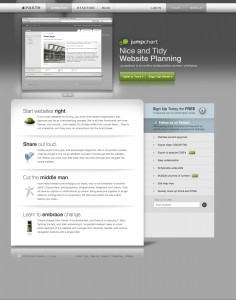
- CSS based promo transitions.
- Video tours with audio commentary.
- Copy and bullet points describing the nuances of how the apps work.
- A unified toolbar for all our apps to encourage cross-browsing.
- Lots of little extras like Twitter links, links to our blog, and an email newsletter signup.
Our “b” and “c” test versions had none of these…
They were simple pages, with almost no content, one screenshot, and a signup form front-and-center. As it stands right now, one of the options, “c” is beating the original by a 97% margin. That’s double the conversion rate… Double.

It’s possible the features in the original are not wrong, but the combination of them leads to, well, less signups for our apps. Crushing, and painful. Not only because of all the lost time and energy creating those extra pages and features, but because of all the lost signups over the last three years.
What we tested.
To start off with, here are the three options we tested:
The original, including all of the above “special features”:
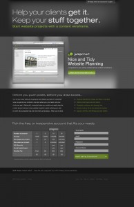
The “b” test which was a simplified version of the first, but without any of the extras. Signup form located right on the homepage- and a minimum of outbound links.
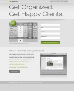
The “c” test was much like the “b” test, but moved the signup form higher, and had a lighter background, and an even bigger headline.
Why we tested it.
We arrived at these tests through a somewhat typical series of events. Like:
- At one point someone asked “do you think our pages are too dark? Would they be more inviting if they were lighter?”
- We read this article.
- We spent a lot of time studying successful app sales sites.
- And we made some wild guesses that always seemed fun to try.
Moving forward.
We’re sold on the usefulness of A/B Testing. We’ll continue to test new theories and check our reasoning. Still, I think it’s important to say that we won’t be ruled by this. Numbers aren’t the only thing we’re after. Apple knows they could sell more iPhones if they added starbursts, unicorns, and “sale” signs all over their site. But they’re not going to any time soon. We think it’s not just about getting there, it’s about getting there our way. So don’t expect us to try 41 shades of blue any time soon.
When all is said and done, it’s about making our sales site better, so people are more inclined to reach our (we think) awesome products. That’s what we’re aiming to do, and we’ll fiddle with the ways we do that as we go. However, we do seriously recommend you try out the http://google.com/websiteoptimizer on your site though. It’s easy to use, provides lots of options, pushes out detailed reports, and, most importantly, has definitely had an effect on our upcoming site redesigns.


